Before the pivot to Domo, it was extremely difficult to find information on story performance.
Our previous dashboards were an ad hoc collection of Looker Studio dashboard URLs, with reporters needing to search for the appropriate documentation to find the right link for the right data point. The dashboards were not customizable and very rigid due to limitations with the data structure, and frequently showed conflicting data points, losing stakeholder trust.
Our transition to Domo aimed to help increase the culture of data by housing our key metrics under one newsroom app, with customizable views and a new data warehouse and star schema to ensure consistency between reports. The primary users of our Domo app would be the newsroom reporters and editors, but newsroom leadership and stakeholders in other departments like product and consumer growth would also be accessing it. Reporters wanted to see quick views of their work, while editors and leadership wanted to see overall trends in their department and newsroom.
User acceptance testing
As the key translator between our analytics and newsroom teams, I led user acceptance testing for our analytics hub in Domo. We only had a week to complete user testing, so we were prioritizing getting the dashboards into the hands of users to know if they could quickly understand how to look up basic functionalities of their job. We chose newsroom users who may not have been tech savvy, placed the dashboards in front of them, and told them to yell out their feedback or write things they liked or didn’t like in a reporter’s notebook next to their laptops.
Iterations and training
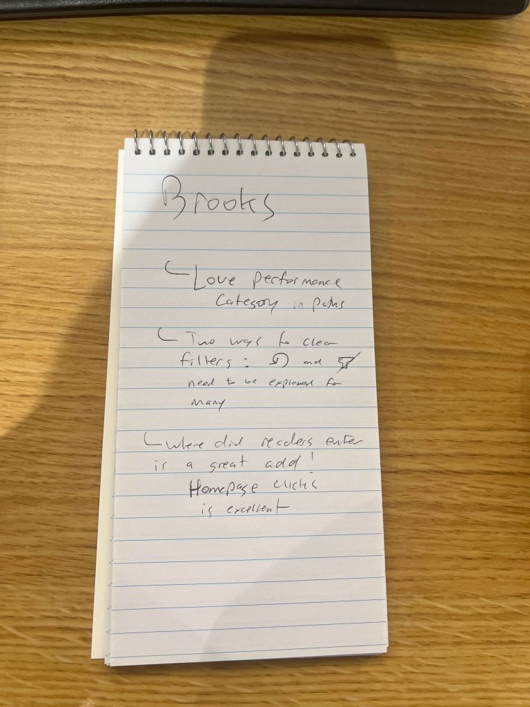
After testing, we found a few key features reporters and editors needed, including the ability to have a built-in feature to filter each dashboard view by an author or group of authors. Folks emphasized the need to have daily data in as early as possible to help make coverage decisions, which allowed us to prioritize optimizing ETLs powering the paths and traffic dashboards to update most days by 9:30. Many struggled to understand things like the new paths performance categories, which we incorporated into training.
Then, I created training videos based on areas where users struggled during user testing. These videos were distributed to the entire newsroom, and we hosted multiple all-newsroom training sessions over four weeks where anyone could attend to learn more about the platform. The paths, traffic and article readership videos also demonstrate the design of each dashboard.
Results
Overall, Domo has had a 73% adoption rate among newsroom stakeholders in its first two months of use, a 30% increase from our previous Looker Studio dashboard setup.
Key findings
Use leaders as influence to get buy-in across the room.
By having meetings with top newsroom leadership before the rollout, we were able to use their excitement as influence to get their teams to adopt Domo into their workflows.
Make key stakeholders feel heard, and deliver on your iterations.
For years, I had heard complaints about our clunky Looker Studio dashboard system and frustrations at having to flip between multiple URLs to be able to find their stories. While we had been making tweaks to our Looker Studio dashboards, delivering an upgraded user experience — and housing all analytics in one place — helped increase the adoption of analytics in our newsroom culture and decision-making.
Make basic functionality as simple as possible, and use testing to determine what “basic functionality” is.
We originally had the ability to filter by authors hidden behind a few menus, where every other customization option was built into the dashboard itself. Looking for a specific author or group of authors was a common use case for almost every user of our new analytics hub. We hoped that this additional menu could be a solution for MVP without requiring a week’s worth of engineering work to build a custom author filter box.
In testing, we found it was extremely difficult for users to navigate to these menus and apply the filters correctly. Even though it required an additional week of work to build a custom author filter box, our stakeholders felt it was much easier to navigate the dashboards to do their jobs, helping with adoption.